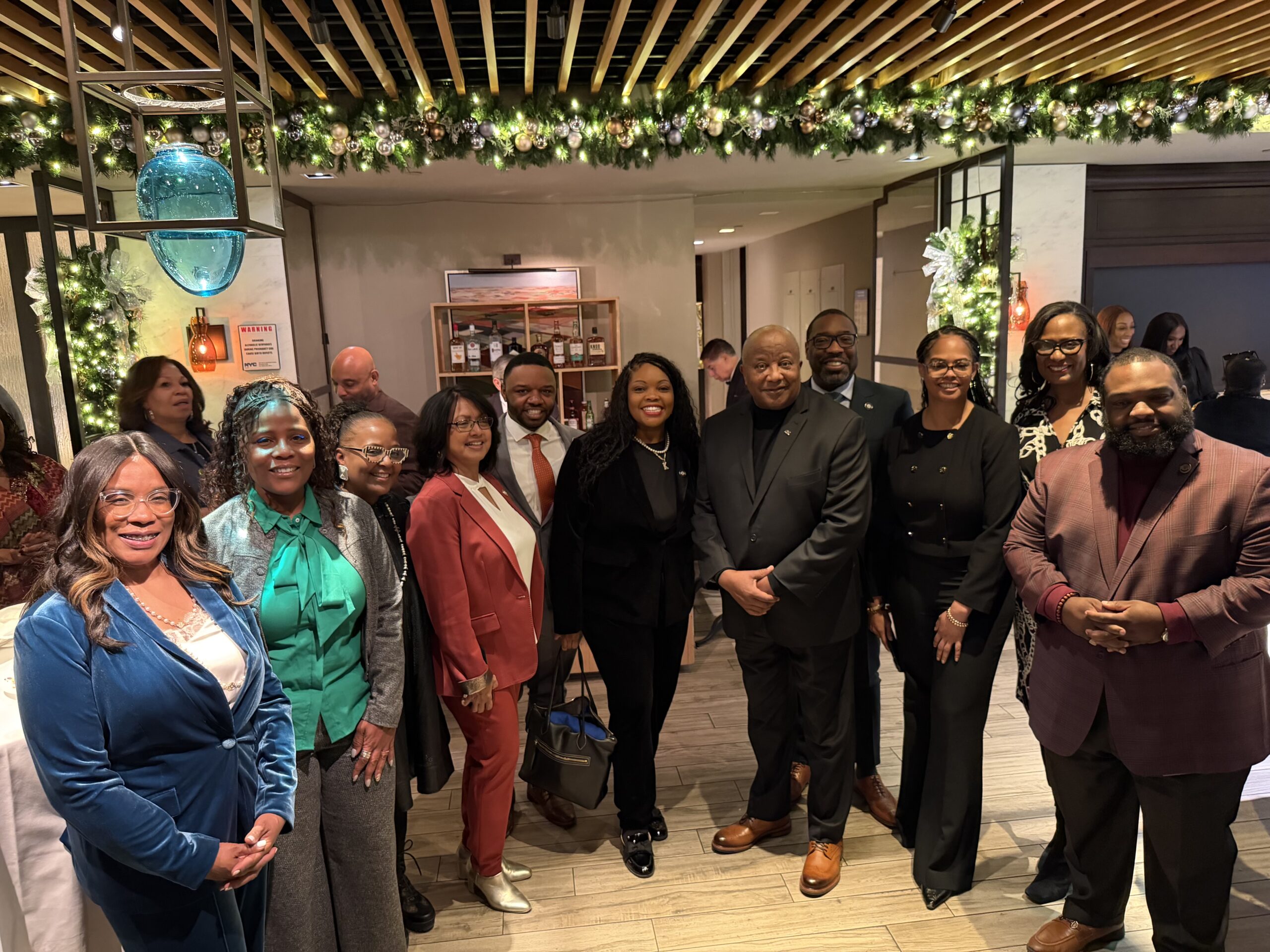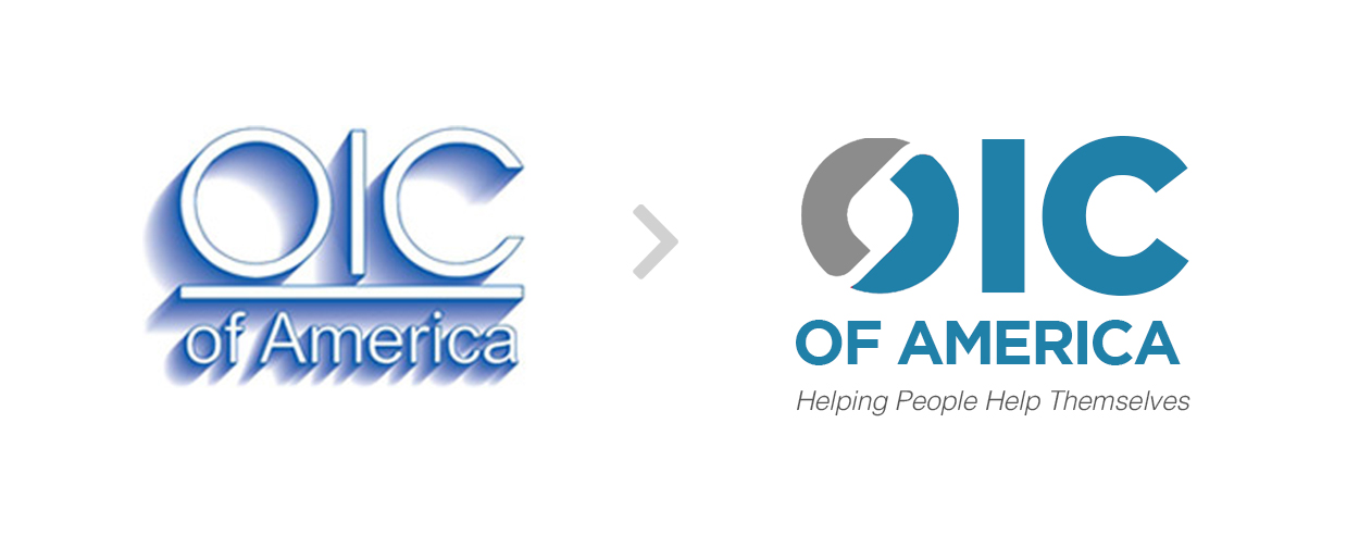
After over 50 years of servicing the community to help people have a fresh start and build a sustainable life, OIC of America now embarks on its fresh new look.
We strategically developed a refreshing feel to reflect progress, innovation, and style. Our pride in the relationships established with communities empowered the team to continue with using the color blue to communicate integrity and trustworthiness with our participants and partners. Our typeface also helps remind our audience that we are a strong, confident, organization that has sustained it place as a national contributor to workforce development. Lastly, the refreshed logo shows emphasis on the “O” that represents “opportunity;” to highlight our vision of a world in which all people are contributing members to their families and communities. We are excited to release our new brand identity, and look forward to introducing ourselves to the millennial generation that will help us continue the legacy of our founder, Rev. Leon H. Sullivan. Branding and Strategy by LoveArts